Color is everywhere, and it has a profound effect on how we feel. The right combination can make a room feel calm and serene or vibrant and energetic. It can make an outfit look chic and put-together or bold and expressive. But how do you choose colors that work well together? It might seem like some people just have a natural talent for it, but creating a beautiful color palette is a skill anyone can learn. It’s less about magic and more about understanding a few simple principles.
This guide is your key to unlocking the world of color theory. We'll break down the basics in a way that’s easy to understand, showing you how to build balanced and stunning color combinations for your home, your wardrobe, or any creative project. Get ready to move beyond guessing and start choosing colors with confidence.
Starting with the Color Wheel
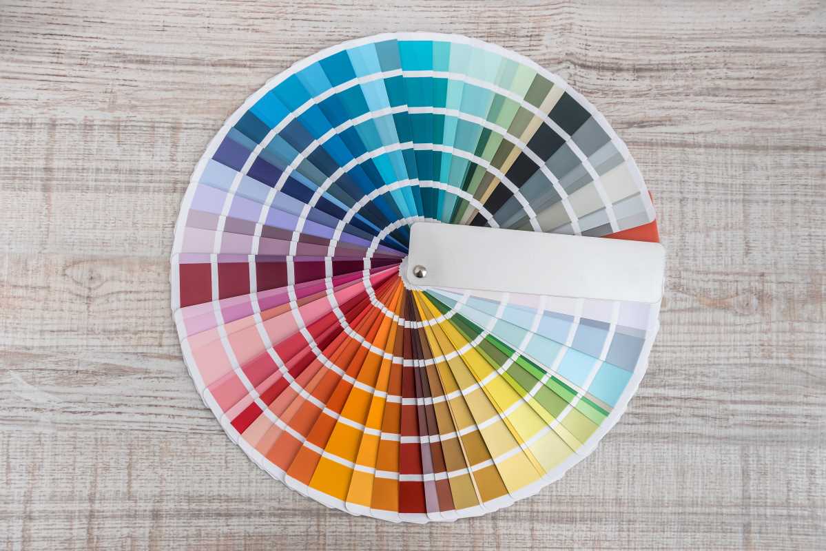
Before you can create a palette, you need to understand the main tool of the trade: the color wheel. You probably remember it from art class. It’s a circle that shows the relationships between different colors. Understanding this simple tool is the foundation for all your future color decisions.
The Building Blocks: Primary, Secondary, and Tertiary Colors
The color wheel is organized into a few key groups.
- Primary Colors: These are the three main colors that can't be created by mixing other colors. They are red, yellow, and blue. They form the base of the entire color spectrum.
- Secondary Colors: These are created by mixing two primary colors.
- Red + Yellow = Orange
- Yellow + Blue = Green
- Blue + Red = Purple
- Tertiary Colors: These are made by mixing a primary color with a neighboring secondary color. This gives you shades like red-orange, yellow-green, and blue-purple. These in-between hues add wonderful complexity and nuance to the color wheel.
Classic Formulas for Color Harmony
Now for the exciting part: using the color wheel to build your palette. Color harmony is simply the idea of choosing colors that are pleasing to the eye. There are several time-tested formulas you can use to find combinations that work beautifully together.
Monochromatic: Simple and Sophisticated
A monochromatic palette is built using only one color. You create variety by using different tints (adding white), shades (adding black), and tones (adding gray) of that single hue. For instance, a monochromatic blue palette could include everything from a pale sky blue to a deep, dark navy.
This approach is nearly foolproof and always looks elegant and cohesive. It's a great starting point if you're new to color theory. In home decor, a monochromatic scheme creates a very calming and restful atmosphere.
Analogous: Harmonious Neighbors
An analogous color scheme uses colors that are right next to each other on the color wheel. For instance, you could combine yellow, yellow-green, and green. Or you might pair red, red-orange, and orange.
Because these colors are so similar, the resulting palette is harmonious and serene. It often mimics color combinations found in nature, like the changing leaves in autumn or the colors of a sunset. To create a successful analogous palette, it’s a good idea to choose one color to be the dominant shade, and use the others as accents.
Complementary: Dynamic and Bold
A complementary palette uses two colors that are directly opposite each other on the color wheel. Think of combinations like red and green, blue and orange, or yellow and purple.
This pairing creates high contrast and high energy. When placed next to each other, complementary colors make each other appear brighter and more intense. This is a great choice when you want to make a bold statement. If a full-strength complementary scheme feels too intense, you can use more muted versions of the colors or use one color as the main hue and its complement as a small, powerful accent.
Split-Complementary: A Softer Contrast
If you like the energy of a complementary scheme but want something a bit more balanced, the split-complementary palette is for you. To create one, you start by choosing one main color. Then, instead of picking its direct opposite, you choose the two colors on either side of its complement.
For example, if you start with blue, its complement is orange. For a split-complementary scheme, you would pair blue with yellow-orange and red-orange. This gives you the high-contrast appeal of a complementary palette but with less tension, making it a very popular and visually interesting choice.
The 60-30-10 Rule
Once you’ve chosen your colors using one of the formulas, how do you apply them? A common mistake is to use all the colors in equal amounts, which can look chaotic. This is where the 60-30-10 rule comes in. It’s a classic design principle that helps you balance your chosen colors perfectly.
- 60% is your dominant color: This is the main color for your space or design. In a living room, this would be the color of your walls. It serves as the backdrop and sets the overall tone.
- 30% is your secondary color: This color should support your main color. It's used for things like furniture, curtains, or an accent wall. It creates contrast and interest without competing with the dominant hue.
- 10% is your accent color: This is your pop of color! It's used for smaller items like pillows, artwork, or decorative accessories. This is often your boldest, brightest color and adds personality to the space.
This simple ratio provides a framework that makes your color choices look intentional and well-composed. It guides the eye smoothly through the design and creates a sense of harmony and balance.
 (Image via